Binary Ninja has always had great support for user-created themes. While implementing a new theme is an easy process, designing a theme can be challenging. My goal is for this post to serve as a reference resource for those interested in creating themes for Binary Ninja. It will cover both the theory behind designing a theme, as well as the best practices for implementing one.
Color palette
In this context, “color palette” and “theme” are almost synonymous, so it’s important to spend time picking out a good color palette before anything else. If I had to give a formula for developing a color palette, it would be the following:
-
Choose 4 to 6 primary colors. These will be used for syntax highlighting in code views, and will define the style and personality of your theme.
-
Choose 2 to 4 neutral colors. Typically these will all be shades of grey, and will be used in the rest of the UI as foreground and background colors.
Once you have your colors picked out, those should be all you need. You may find that you need an extra shade of a color here or there, but try to work within the bounds you initially set. Less is more.
 Pro tip: Tinting your neutral colors — i.e. using a slightly cool or warm
gray — often looks better than just plain gray.
Pro tip: Tinting your neutral colors — i.e. using a slightly cool or warm
gray — often looks better than just plain gray.
One point I cannot stress enough is the importance of contrast. If you are using the formula above, you should make sure all of your primary colors should have contrast not only with themselves, but also with the neutral colors. What this means is:
- your primary colors should differ from each other enough that you can easily tell them apart; and
- text set in your primary colors should be legible against any of your neutral colors as the background.
It’s no secret that working with colors is difficult. In fact, choosing the colors for your theme is often the hardest part of the design process. When I need some assistance, some techniques I like to use are the following:
-
Use or extend an existing color palette. Many brands publish their color systems freely online. You can use these to find colors you might like that already work well together. Some examples include the design documentation published by Atlassian, GitHub, Adobe, or Stack Overflow.
-
Use palette building tools. If you already have a few colors you like, or want to create a color palette from scratch, tools such as Adobe Color, Coolors, and Palx are very useful.
Don’t get hung up on picking the perfect colors before starting on your theme. You will almost certainly tweak colors along the way, regardless of which approach you take. (If you use color aliases, which will be covered shortly, tweaking colors is an easy process anyway.)
UI planes
One thing to keep in mind when assigning colors for UI controls is a concept I like to call “UI planes”. This is the idea the idea that certain controls are “sunken” and others are “raised” — appearing to occupy different spaces on the Z axis. This was especially true in the era of skeuomorphic designs, but still holds true in UIs with more simplistic or flat styles. Conforming to this convention makes the UI easier to navigate.
 An example of bad (left) and good (right) color assignment.
When assigning colors to the palette group, try to follow the following
convention for the most natural appearance:
- Text fields and lists which use the
Basecolor are darkest - The window background —
Window— is lighter thanBase - Buttons and dropdowns which use the
Buttoncolor are lighter thanWindow
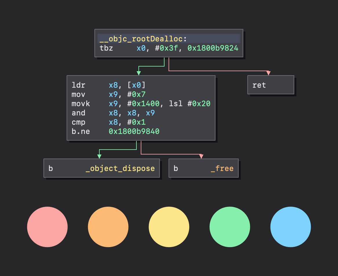
It’s worth noting that the Qt Fusion theme used by Binary Ninja assumes this is the case, so sticking to this convention is a good idea. This logic also applies in linear and graph disassembly views; it makes sense for function headers and graph nodes to be lighter and raised, while function bodies or the graph background to appear darker.
Implementing a theme
Now that some of the theory is out of the way, we can dive in to implementing themes. If you have never made a Binary Ninja theme before, I’d recommend taking a look you at the example themes as well as the new Theming Guide in the Binary Ninja User Docs that details how each color is used. It might be a good idea to keep it open for reference while you work on your theme.
Using aliases and blending functions
The theming engine supports defining color “aliases” or variables inside of your
.bntheme file. This is highly recommended as it makes iteration faster and
easier. In addition aliases, you can also use the built in mixing functions to
derive colors from your existing palette. For example, see the example below:
{
  "colors": {
    "red": "#ff0000",
    "blue": "#0000ff",
    "purple": ["+", "red", "blue"]
  }
}
Notice anything new? The ability to specify colors as hex strings was added in Binary Ninja 2.4.
First, red and blue are set up as aliasies; they can now be used anywhere
else in the theme file. Then, a new purple color is created, and set to
average of the red and blue colors. More info on the blending functions is
available in the Theming
Guide.
Going the extra mile with stylesheets
The ability for theme authors to apply Qt stylesheets to UI elements was also added in the 2.4 release. Stylesheets are a great way to give your theme a distinct look or customize specific details of the UI. That being said, stylesheets can be a bit unwieldly at times and can quickly ruin the appearance of your theme if not used artfully.
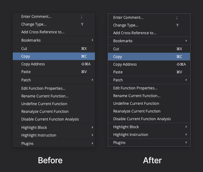
Shown above is an example of how stylesheets can give your theme a little extra polish, in this case, making context menus a bit prettier. I’d actually recommend all theme authors include this in their themes. A crude template can be found below, although it should be tweaked on a per-theme basis for best appearance:
QMenu {
  background-color: palette(base);
  border: 1px solid palette(button);
}

QMenu::separator {
  background-color: palette(button);
  height: 1px;
}

QMenu::item:selected {
  background-color: palette(link);
}

QMenu::item:disabled {
  color: palette(button);
}
The palette(...) function is a feature of Qt. If you’re using colors from
your theme’s palette in your stylesheet, it’s quite helpful, as it saves you
from having to update your stylesheet manually if a color changes. More details
are available in the Qt
Documentation.
Testing your theme before release
Creating themes is exciting, and it may be tempting to share your theme as soon as you think it’s ready. I’m guilty of this as a theme author myself. As is often the case, there are usually forgotten edge cases in the first draft of your theme that will negatively affect its appearance. Before releasing your theme, ask yourself the following (non-exhaustive) list of quality-control questions:
- Is there enough contrast between all of my theme’s main colors?
- Does my theme provide enough contrast for text to be easily readable?
- Is each UI plane clearly distinct under my theme’s palette?
- Does my theme define appropriate colors for selected text and tokens in disassembly views? Is text still easily readable when selected? Pay attention to edge cases like opcode bytes and annotations which are typically dimmer.
- Does my theme support users with color blind mode enabled? Enable the
ui.colorBlindsetting and take a look at the disassembly graph. If the branches between nodes look wrong (or the same as before), check what you have setaltTrueBranchColor,altFalseBranchColor, andaltUnconditionalBranchColorto in your theme. - Does my theme utilize the
disabledPalettekey to give enabled and disabled UI controls distinguishable appearances? - Does my theme assign appropriate colors for the Python console? See
scriptConsoleOutputColor,scriptConsoleErrorColor, andscriptConsoleEchoColor.
Closing remarks
I hope this post has taught you more about creating Binary Ninja themes. I laid
out a lot of rules, but as is often said in many creative practices, “learn the
rules first so you know how to break them”. Creating themes should be fun, and
in the end of the day, the best theme is
Reflection the one that
works for you, so feel free to break the rules where you see fit. I hope this
will be a helpful resource for those interested in creating themes, or has even
inspired you to create your own.