(EDTIOR’S NOTE: This introduction is by Jordan, but thanks so much to Kyle for the rest of this content)
We have mixed feelings at Vector 35 about April Fools jokes. They’re often very entertaining but they also have a tendancy of making April 1 a painful day to surf the web (here’s looking at you, Stack Overflow. For that reason, we’re going to give you the choice of a real update, or a fake one! For the real update, head over to our Hackathon Recap which includes details on several major new features!
Otherwise, carry on and enjoy. You’ve been warned. :-)
1.2 features now!
If you’re in our Slack, you’ve probably heard a lot about the up-and-coming “1.2”. There’s a lot of features still coming in that updates, which you can check out under the GitHub Milestone, but by far the most anticipated changes that have been coming down the pipe are all the graphical changes. And, as the title of this post alludes to, the 1.2 Graphical Update has finally landed! There is a lot of ground to cover, so we’ll dive right into the new UI Changes, how to write your own UI Plugin, and finally What To Do When Something Goes Terribly Wrong.
UI Changes
We take every opportunity we can to listen to our users, and there has been no better place for us to do this than our Slack (seriously, if you’re not over there you should join). One thing we did back in January was send out a survey for you to let us know the features and changes you most want to see us make to BinaryNinja in 2019. We were extremely pleased with all of the engagement from you guys, and immediately started work on those things you have wanted to see from us. One of those things, unsurprisingly, was the 1.2 Graphical Update. What did surprise us, however, was some of the feedback we got about the current UI. Insightful responses started rolling in, one after another, making comments that we were simply not expecting. One user even said,
Where's my power? -OneUser
and another user demanded:
"It’s 2019! We need more powerful GUIs!! We need the power!" -AnotherUser
With thoughts like these and many more in mind, we set out to make the changes the community seems to be demanding.
We knew that to address these concerns, we would need to completely overhaul the current GUI system, so we set out in search of the most powerful GUIs that currently exist. Considering the number of different UIs and design philosophies there are, and we were making a decision that was going to change the face of Binary Ninja for good, we didn’t untake this task lightly.
We were searching for our “unicorn” that delivers the power demanded by our users, with dynamic and robust support needed for users at all levels on all platforms. As not to bore you with all the experiments and iterations we went over, we’ll skip right over to the interesting part, the UI that we feel really delivers the power.
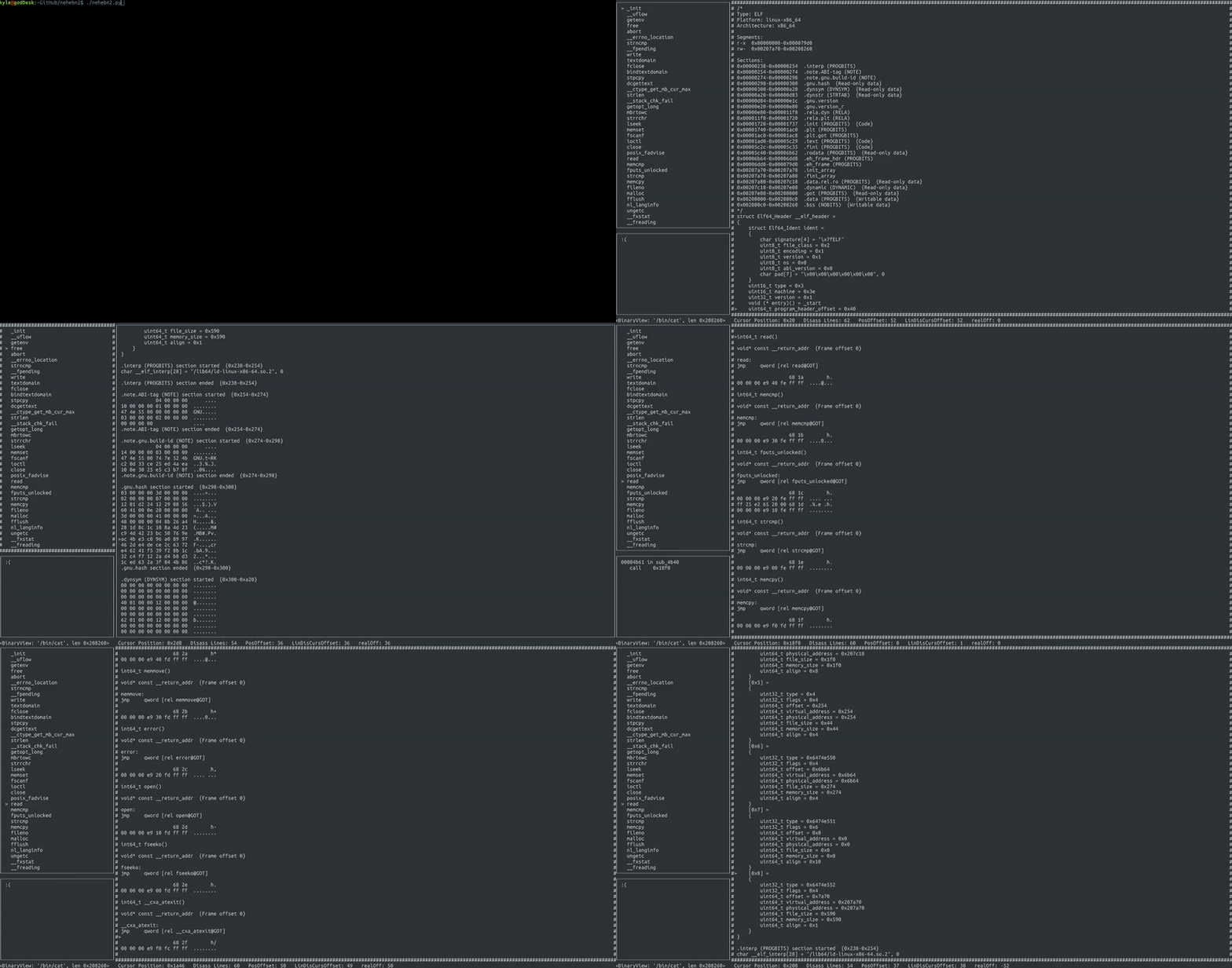
Finally, for the very first time, we proudly present our brand new UI, powered by Curses:
 New UI demo - Figure 1
Immediately you’ll notice a lot of changes. We’ve cleared up a lot of the gunk that used to clog up the welcome screen: goodbye to patch notes, recently opened files, and file menus! And now, by moving to Terminal, we can harness Native Tabs provided directly by the OS itself, window borders that you control, and completely remove the need for you to ever need to waste time moving your hand away from the keyboard! Now, more than ever, the power of BinaryNinja is right at your fingertips.
We realize this move may shock a lot of you, but it’s best put in the words of a user:
Wow. -AUser
And of course it’s critical that with this UI update we include user keybindings! Any action can be remapped with a simple change to a single JSON file:
{
   "Version" : "1.2",
   "Key_Shutdown" : "KEY_F(1)",
   "BinaryNinjaContextSwitchView" : " ",
   "BinaryNinjaContextSwitchFocus" : "\t",
   "linearDisassemblyScrollDown" : "KEY_DOWN",
   "linearDisassemblyScrollUp" : "KEY_UP",
   "functionListScrollDown" : "KEY_DOWN",
   "functionListScrollUp" : "KEY_UP",
   "hexViewLineDown" : "KEY_DOWN",
   "hexViewLineUp" : "KEY_UP",
   "linearDisassemblyPageDown" : "KEY_NPAGE",
   "linearDisassemblyPageUp" : "KEY_PPAGE",
   "functionListPageDown" : "KEY_NPAGE",
   "functionListPageUp" : "KEY_PPAGE",
   "hexViewPageDown" : "KEY_NPAGE",
   "hexViewPageUp" : "KEY_PPAGE",
   "hexViewRight" : "KEY_RIGHT",
   "hexViewLeft" : "KEY_LEFT",
   "functionListSelect" : "\n",
   "popupWindowGoto" : "g",
   "confirm" : "\n"
}
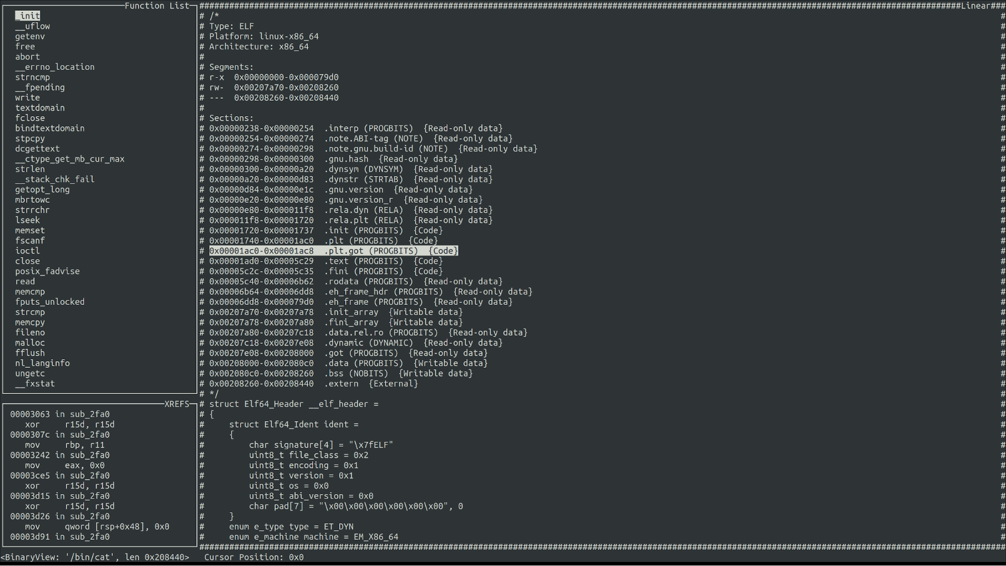
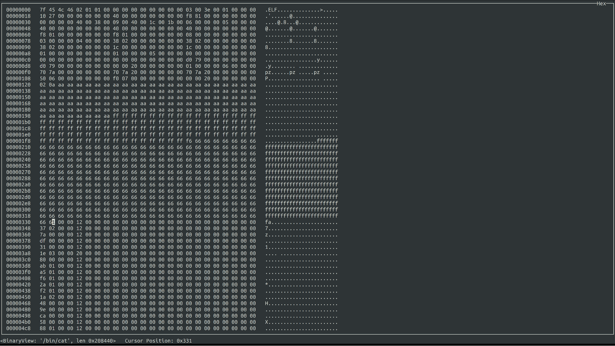
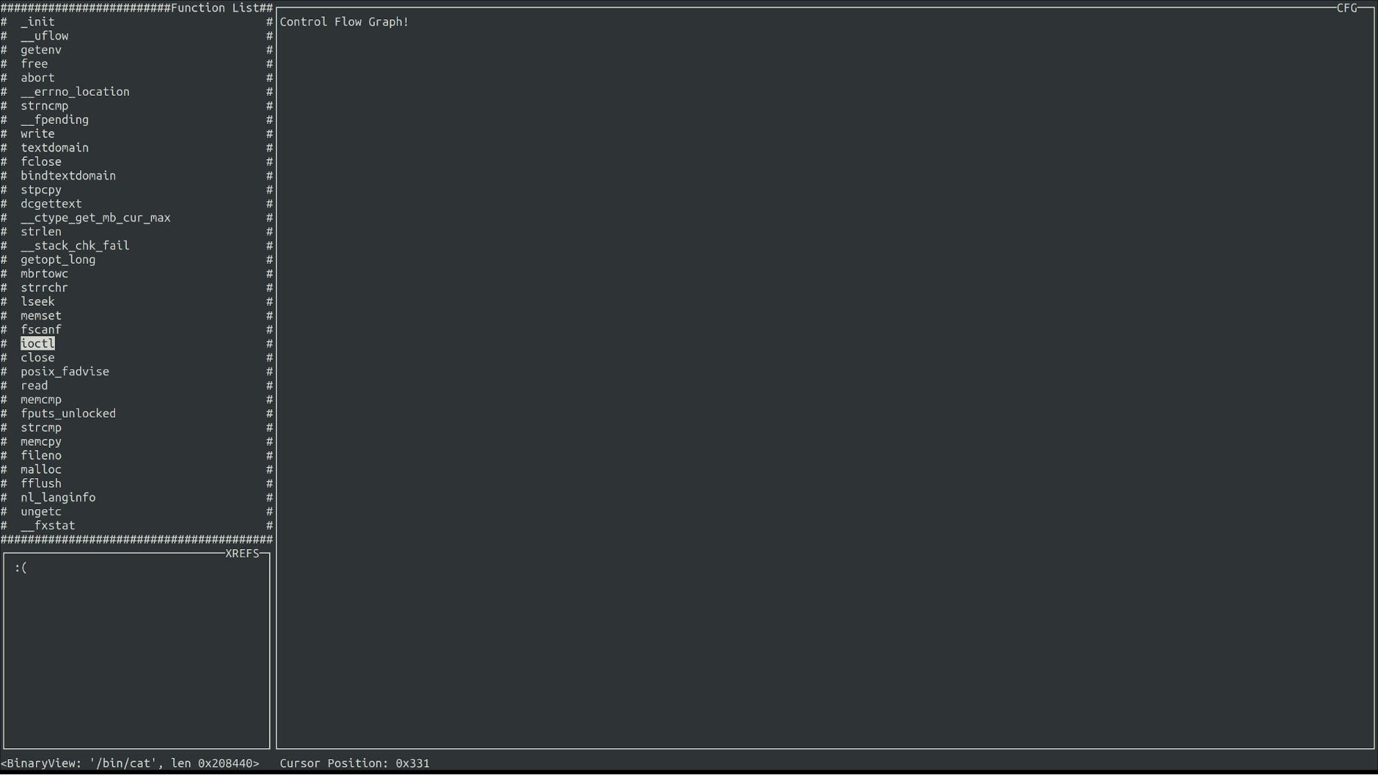
To let you absorb everything that’s going on here, let’s show off some more of our views.
 Linear View (With Highlighting) - Figure 2
 Hex View (With Editing!) - Figure 3
 Control Flow Graphs - Figure 4
Writing Your Own UI Plugin
Most importantly, with this update, comes the ability to define your own views easily. Luckily, since we decided to open source the entire user interface, your UIs have the very same amount of impact that ours do.
What To Do When Something Goes Terribly Wrong
As always, when something goes wrong, feel free to file an issue, a pull request, or talk to us on Slack.
We know many users are excited about what they can do with the new update and we’re excited to see what you do with it as well!
Happy April First!